Ant White
Personal and Professional Practice
Archives


OUGD405: Design Progress -Study Task 1 - Group Crit
Today we presented research in the form of a group crit, I presented the free boards, as you can see on my exam practice blog click here. First I began explaining my primary research my secondary research and my action plan. My primary research consisted of work which I collected, emailing charities, taking photographs, and doing a research section around Leeds, To verify what active charities are operating in Leeds. I also presented the responses from the charities, I asked them, if I were to donate 1 pound what percentage of that pound would go towards the cause, or emergencies, expenses, such as travel equipment wages, and what percentage will go towards future investments so advertising, to generate future income. My secondary research consisted of how the split is applied, so, I went on the internet and researched how it actually is used, for example I looked specifically some charities, and found out what they do for money, for example I found some posters are certain charity and I evaluate the effectiveness of the posters and whether or not it was worth the 7% of the budget. I also looked at merchandise, for example, I looked at fashionable wristbands made of rubber which you can purchase, And the effectiveness of creating awareness of the charity, and promoting the cause. I found that be over 9%, of the 1 pound which you can donate, will go towards paying for establishments, such as charity shops, and had offices. I also found that it pays wages for staff such as CEOs, executives CallCenter operatives and any other staff. Finally, I found out where the other 84% on the budget would go, and that was a cause, whether it be steeving starving children, or providing a dog in new home. Which is what you would expect from a charity!
Feedback I received was generally good however we did establish that from the charity's reluctaantsey to release the spending percentages, that they may be ashamed of their percentages, And they may not want the public to know is it may deter donations. So, but I next briefing it'll be interesting to look into how providing the percentages to general public, if it affects willingness to donate to a charity.
The question we were given the end of the Crit was; "How can I get more people to donate to charities?" This would lead on to the next brief on the week of 3 December 2012. Click here to see the progress on this weeks brief.
OUGD403: Group Crit: Message and Delivery - Mail Shots
The Crit Feed back sheets which I received


I am moderately happy with the feedback I've received, the text seems to communicate the message correctly and the intended audience is also correct. However, there are alot of things which need adjusting. Firstly, most importantly, is adjusting the variables to fit the brief, the sizing of the mail shots is wrong, it should be 220x110mm, mine is not. The original document in Illustrator is the correct size, however, due to the printer size adjustments and the crop marks being squeezed on the page, the mail shot as reduced by around 1-2cm, which I didn't notice. I'm pleased this was pointed out in the crit, otherwise I would have not met the criteria asked.
Another error which was pointed out is the colour balance, in the illustrator file, I use two different shades of blue, and their half tones. However, due to a printing error, again, some of the colours appear purple or grey, not looking like a half tone of one of the original blues, so, I must make this more clear in the improved mail shots.
Another adjustment which needs to be made involves the sonar wheel, which can be found inside the leaflet, although I think this is a nice concept, It is hard to achieve, and it didn't work effectively. It was flimsy and it made some of the text hard to read, I also had difficultly obtaining appropriate split pins, so the ones I ended up with had a glittery texture, which do not fit the theme of the mail shot, so I'm going to remove it and only use the text under the sonar wheel.
Another dilema, I'm not longer able to access the digital print room, which means I'm limited to A3 paper only, so, I'm going to have to alter the fold of the page, so it fits on A3, rather than having a vertical crease, so it folds out horizontally which would exceed the page size, I'm going to have to have an horizontal crease, so the page folds vertically.
Another dilema, I'm not longer able to access the digital print room, which means I'm limited to A3 paper only, so, I'm going to have to alter the fold of the page, so it fits on A3, rather than having a vertical crease, so it folds out horizontally which would exceed the page size, I'm going to have to have an horizontal crease, so the page folds vertically.
See further designs for the re-edit
OUGD403: Group Crit 9/11/12
Today, we had group crits. The crits were different to how we usually have them, we are split into two groups, and then asked to Crit three piece of work in 45 minutes. Which is unusual, although I enjoyed it! The Crit enabled us to get a wider range of feedback, getting feedback from three different people.

The crits not done in person, we were out of the room, whilst other people critiqued our work. This meant people could be more 'brutal', than they would be in person to you. Getting more honest feedback from the critiques.
The feedback I received was generally good, The three people, whom critiqued my work, all understood what I was trying to communicate, which was great news. As you can see below I have images of both sides of the critique paper, which they gave me following the crit.
Insert images here.
A couple of suggestions, which the critiques had, was to experiment more with colour, which I will try, However, the brief instructed only two colours, and stock (the paper) was to be used. Which, does not leave much room for experimentation, as the two tones of blue which I used and the White stock fore-fills. Another suggestion, which I was given, was to add some facts to the text pages, As the subject of Wales been affected by Sonar is not a common topic, so, not many people know the statistics. So, I shall try and include this in my next designs!
Apart from that, all feedback was generally positive. They said my images work together, and they communicated the message very clearly and easily, this I'm happy with.
OUGD403: 26/10/12 Group Crit (Newspaper)
For the group crit today, I presented the information from:
The research seemed to intrest the group whom I presented it to, the following discussion on which would be the best area to do extended research into would be sonar, and how marine mammals use sonar to detect obstacles and life forms without the use of sight.
OUGD402: Question 5
The Quality of written elements - are they well structured? Am I using broad graphic-design-vocabulary?
OUGD402: Question 4
Does my blog show individual improvement? Can you see me developing and improving?
OUGD402: Question 3
Are all of my blogs consistant? By this I mean, do they support each other, with an even spread amount of work with co-insides with each other?
OUGD402: Question 2
Am I communicating my ideas effectively? Are there links between the brief? Is it consistant? Is there a substancial record of visuals?
OUGD402: Question 1
Is there a substancial amount of research on my blogs? Are the images analysed to a high standard? Is there a good selection of images?

OUGD403 Alphabet Soup, Task 2, Group Crit
Today, we had to present our work so far in a group crit, we had to explain what we have done, why and what we hope to achieve - standard crit stuff. I saw some really interesting work for other members in the crit, and I really enjoyed seeing what over people came up with.
When it came to my turn, I explained what I was doing so far.

The main focus of my delivery was this, the design sheet for the font. Based on Neville Brody's Industria, I explained how I've modified it to fit Lizzy's personality, in a subtle manner.
I stated why I chose Industria, based on the work by Noma Bar, and how the two are similar.
The first thing I explained, was the most important, the exaggerated ascenders and descenders on the letter forms, which are there to represent Lizzy's style of speaking, adding the word "so" to empathises things.
I also went to explain some of the smaller details I've added, such as the slightly rounded edges to the letterforms, instead of the shaper edges to represent Lizzy better, as she doesn't have a sharp personality, as she's a nice person.
Finally I explained some of the stuff I'd like to do with the font, in the week to come. The first of which is the add some of the shapes into the negative space, in the style of Noma Bar, which was also suggested by the Tutors in the progress crit.
3 Things I need to do
Add the shapes into the negative space, in the style of Noma Bar
Fine tune the shapes letter forms
Work on the badge, as no work has been done as of yet
STUDY TASK 3 - What is Graphic Design? - Part 2
Context

The recognisable 007 brand logo of the James Bond Franchise, I really like the simplistic design of this brand logo, which has stood the test of time since the 1962, when the first film of the 23, soon 24 super series was shown.

The above would be intended for publication, as the context. I really do like the design of this, and it's monocrome theme with the cream colour poping the image.
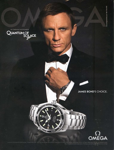
The above's context is advertisement. It features a nice simple design, easy to read, and clear. It also uses the James Bond brand along side this as endorsement, It's also using a very limited colour range in the ad, which works very well.

The above is an info-graphic, the context being directional way-finding. I really like the simplicity of the designs, nice, clean and to the point, easy to see, and the images on the signs make them understandable, even without the text.

The context of this would be promotional, it's a mini decorated in the Park Inn colours, Park Inn are recognisable by their bright colours in the checkered pattern, so covering a car is a really fun and creative way to be promotional.
Functions

The above is an info-graphic, the function of which is informing people about the Titanic tragedy, in an interesting and creatively beautiful way. I really like the design of it, and the colour scheme, using simplistic vector designs. It's really cool.
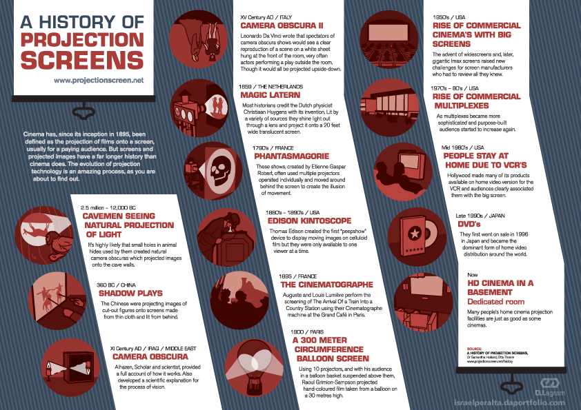
The above, the function being an info-graphic, informs us about the history of projection screens, dating back to the cave-men era to modern day home cinema in the basement. I really like the red limited colour scheme in the images, which correlates with the heading copy in the white text boxes to the side.

The above, the function of which, being again an info-graphic, Illustrates the advancement of human weaponry throughout time, in a simple and creative way. Once again, I really like the style of this, the vector shapes creating the tanks ans skyscrapers, and the people look fantastic, in the limited colour set, or yellows and greys.

The above, the function, once again, being an info-graphic set to inform people survey results, about "which Star Wars fi'm is the most favourited", it communicates this well.
Finally, for this section, we have another image, which it's function is to inform; it's in info-graphic. It takes a some-what boring subject and communicates it in a interesting and attractive way, I really like it. The break down of the images makes the process much easier to understand.
Messages/Ideas/Concepts

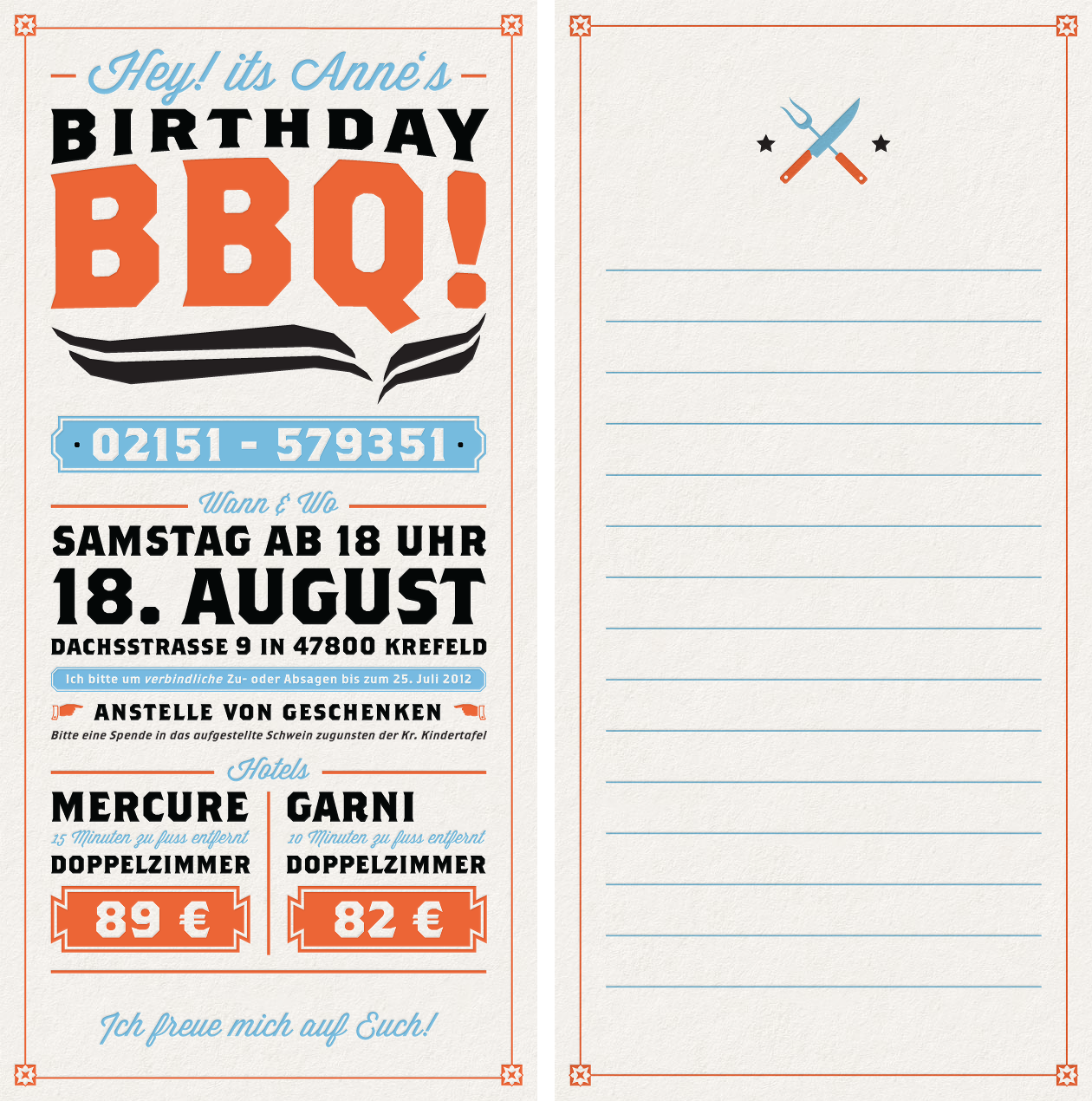
I really like this image above, it's an message, it's an invitation to a BBQ, as you can clearly see. It's well layed out, using oranges, blues and black as it's main, limited colour set, and works really well!
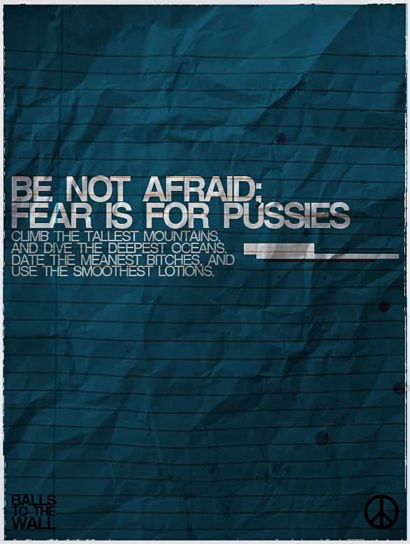
The above is a message once again, a message. It has a really nice and simplistic design to it, using a nice gradient of colour.
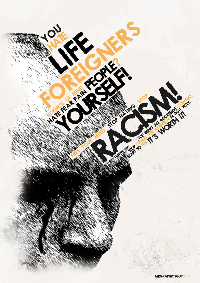
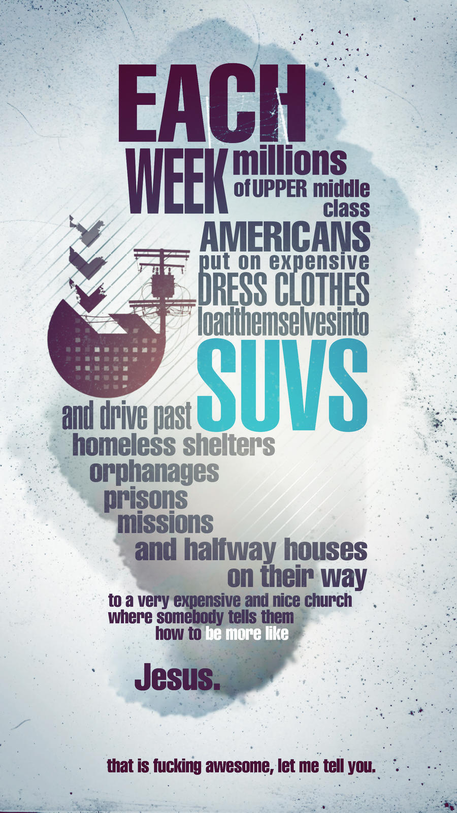
The above is an expressive statement, It's communicating anti-racism, and the hatred towards racism. It works really well, the monotone colours with the orange making the key words pop in the image, in a contrast to the blacks and whites.

Tone of Voice
The above is an example of a blunt mature type of voice.
The above uses a mature, clam tone of voice, presumably addressing a large audience.
Another example of a mature tone of voice.

The text itself in this image has a particularly mature tone of voice, however, the way in which the type is presented indicates an almost immature light hearted sense to the image.

The final image of this set is a fairly light-hearted sensible, standard tone of voice, however the visual communicate in the image, the stylisation of the text adds a fun quality to the tone of voice, adding a layer of meaning to the image.
Intended Scale
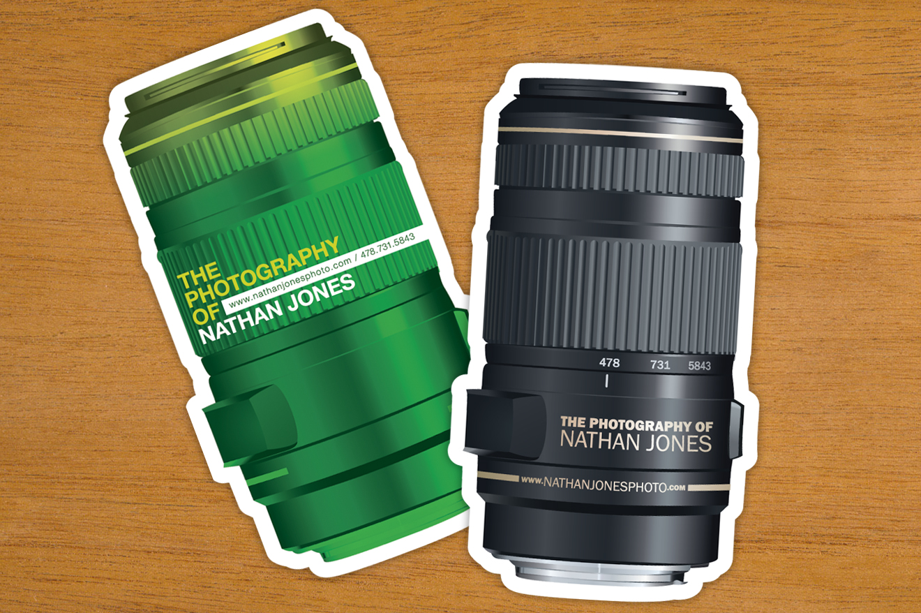
The above would be printed business card size, which is roughly around 80x45mm. I really like the design of these, It's creative and cool.
The above would be printed flyer size, A6.

The above would be printed poster size, between A3 and upwards, typically A1.

The above would be a magazine spread, typically two A4 sheets, on one a A3 spread.

The above would be a billboard size image, a very large image.
Alphabet Soup Self Evaluation

What I was asked to do
Produce a set, series or sequence of ten letterforms that explore and communicate your interpretation of the word that you have selected from the randomisers.
Using your newfound appreciation of the anatomy of typographic forms and the wealth of research that you have already gathered, focus on the manipulation of existing letterforms in order to solve this problem.
What I've done
I created 10 letter forms based around the word "Layer", I used a range of techniques and styles, manipulating letter forms, for the desired effect. I then was asked to narrow these down to five letters, which I believed communicated layer the best, those are displayed above. They were then assessed in a group crit, where, along with 25 other letter forms were narrowed down to the best. Sadly, they were unsuccessful.
Was it successful?
I believe I've completed the task to a good standard, I finished the work on time, and I had all the letter produced to a good standard. The general feedback I gained was, for the most part, positive. I am very happy with the work I've produced, although there are always improvements to be made.
What worked?
The layering of some of the letters, such as on K and Z worked really well, and really communicated the word layer effectively.
What didn't work?
Some of the letters, which I tried to communicate the "layer" by using shadows. For example the T, didn't work, as it required very intricate shading, which I didn't have time to do.
If I were to re-do the project, what would I do differently?
I would try to using the black and white layering technique in more designs, and scrap using technical drawings with shading.
STUDY TASK 2 - 'What is Graphic Design ?' - Part 1
TASK
Using the online resources that you have been introduced to in the lecture studio workshop and with reference to the quotes used in the 'What is Graphic Design - Part 1' Presentation. Source, present and blog. examples of current design practice that reflect your creative interests. Choose 5 criteria from the list below that will guide your selection of work
- Creative use of Type
- Visual Quality
- Tone of Voice
- Attention to detail
- Simplicity of Design
- Meaning or Message
- Audience engagement / interaction
- Style or aesthetic quality
- Use of Media & Method of Production
- Relationship between Form & Format
- Interest in the content.
- Use / Choice of language
- Structure & Layout
You should identify a minimum of 5 examples for each of the selected criteria. Visual responses to these prompts should be posted to your PPP blog and supported by a short explanation of why you have chosen each example. Once you have completed these responses create a post on the Level 04 Yourboard that directs your blog group to your responses on the PPP blog. Take some time over the next week to review and comment on the responses of your Blog group.
Creative use of Type
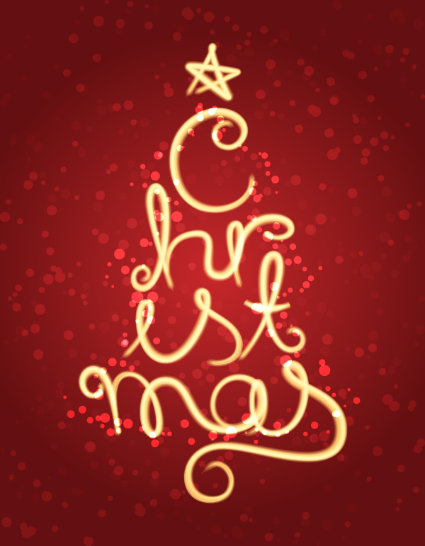
In the image above, I think the type is used in a very creative fashion. The soft, warm coloured, translucent type, in the form of a christmas tree is done exceptionally well. It really emphasises the feeling of Christmas.
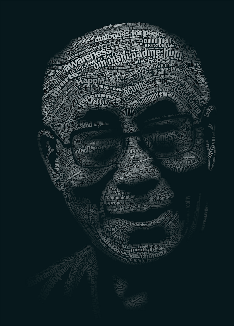
The image above uses type to create an image of the Dali Lama. Using a variation of the point sizes in the image, and the opacity of the type to create the light and shadows, adding depth to it.
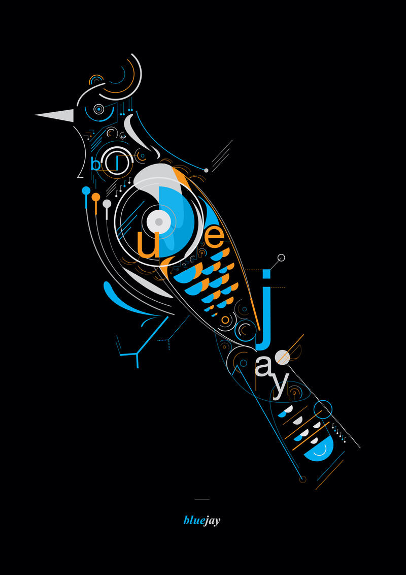
This image above uses type to as part of the image, complementing the vectors in the image. It also spells out the name of the piece, and what the image depicts; a blue jay.
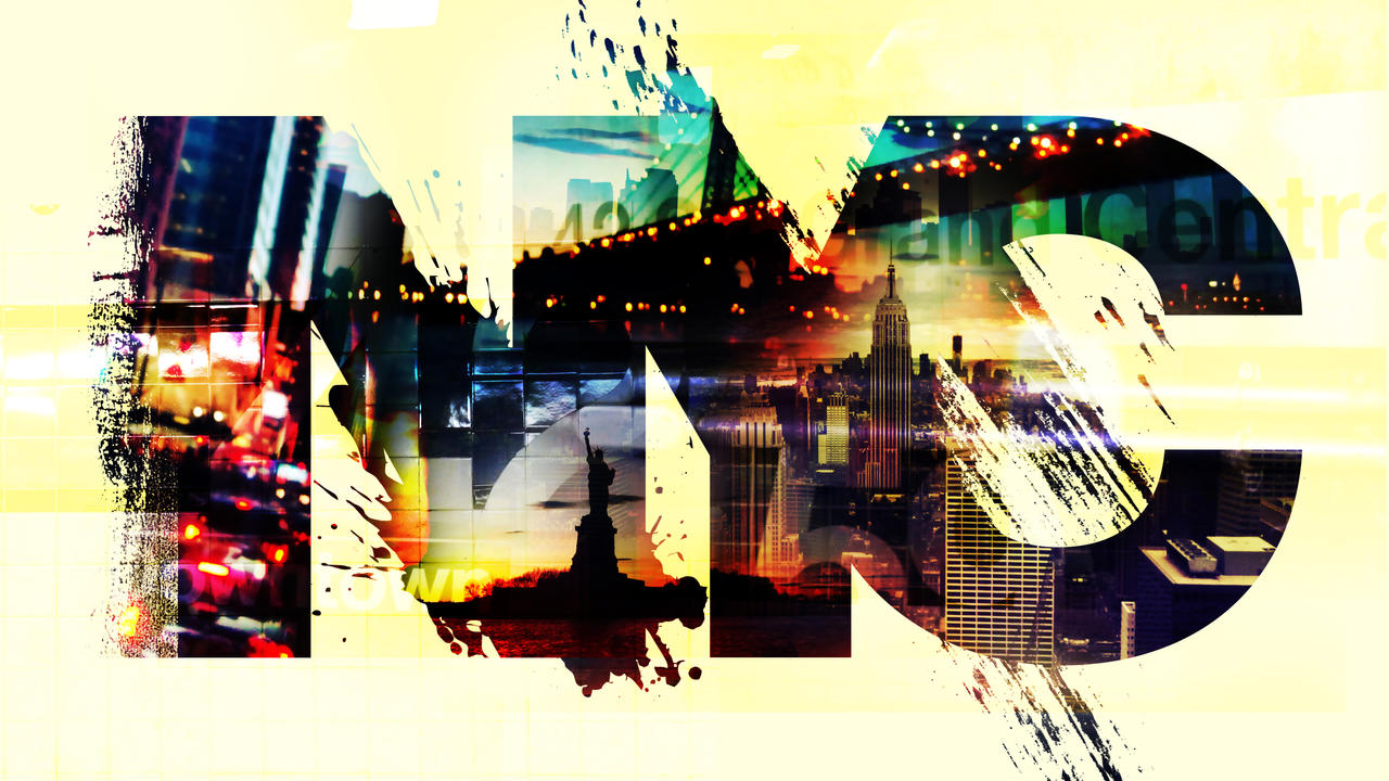
Above, we see the letters NYC. Acting as a frame for a image, containing images which representing the culture and monuments in New York

The final image, which I believe is creative use of type would be this image, spelling the word octopus from octopus tentacles. I really like this, It's fun and creative.
Simplicity of Design

The design above has a very clean, simple layout to it. I like this image as it had been made through using very clean vector images, nice crisp colours.
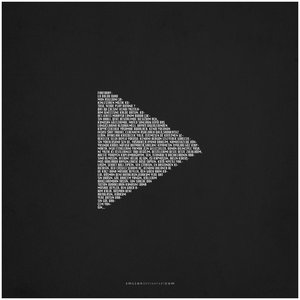
The image above is a play button, in the centre of a page, made from text. I like this image, not only because of the creative use of type, but because of the contrast between the white and the black, very modern and simplistic.
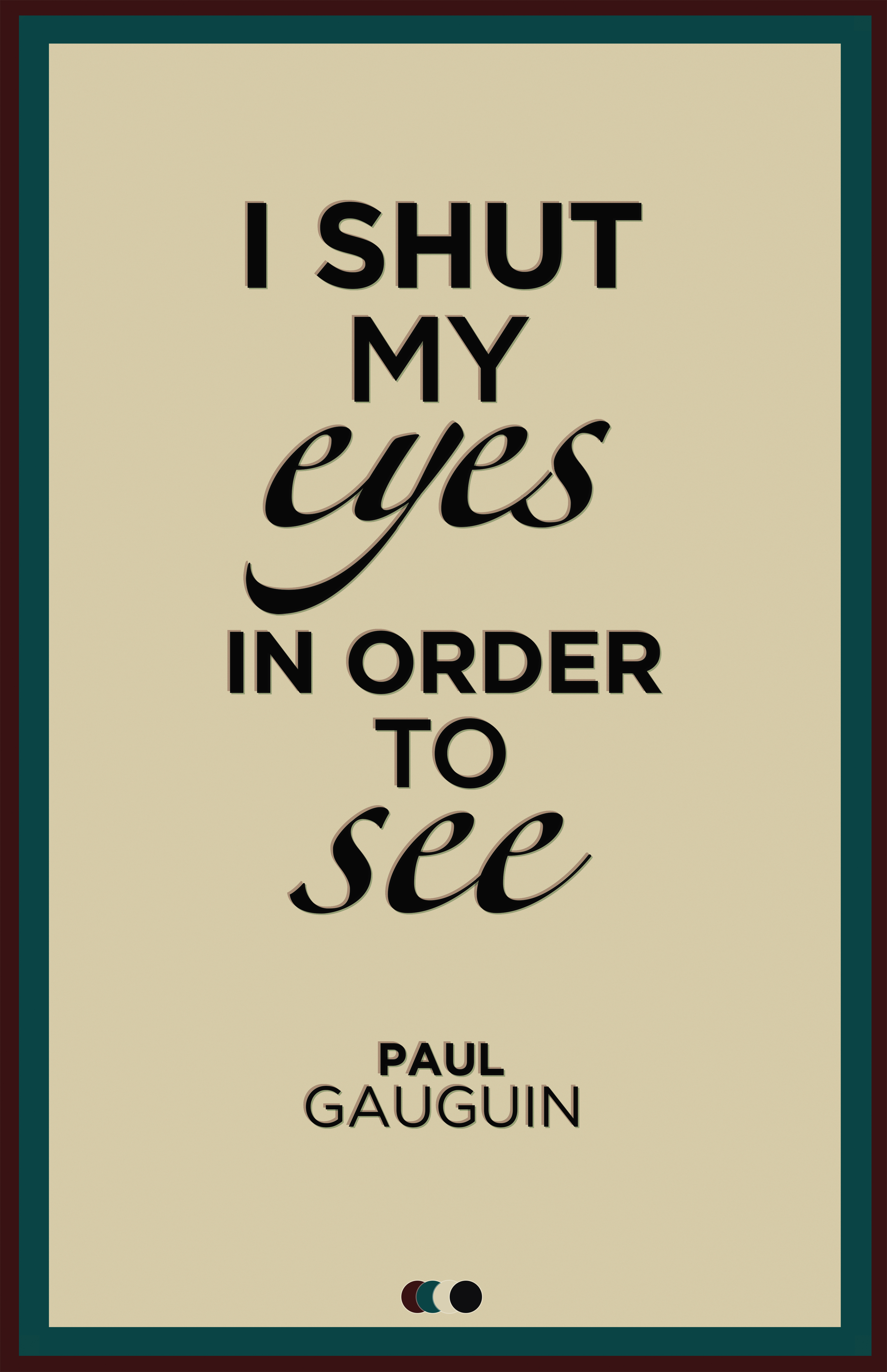
The image above is a "quote image", I like it because of the mild-tertiary colours used, giving the image an almost bland, sophisticated look, rather than bold bright, perhaps juvenile colours.

The image above is a simple text piece, using dark colours in the background, such as the greys, and then using a light baby-blue text, contrasting with the simplistic background, to make the text stand out.
The image above is very simplistic, using only three colours, red, yellow and white. I really like how the image has a warm feeling from these colours, and the simplistic centre-aligned text and image has a nice quality to it.
Visual Quality

The image above has very good visual quality, the mark-making from the, perhaps, custom brushes with the greyscale images, overlaying the standard text, over a paper-texture background looks simply phenomenal In my opinion.

This image, In my opinion has fantastic visual quality. I love the simplicity and the design of the image. It has a nice overall feel to it.

The image above, using twigs to form the work crow, with crows flying above the word, looks fantastic. I really like the overall design of the image, and I think it has brilliant visual quality.

The image above, I believe has nice visual quality, with the low, dark texture background, with the vibrant text contrasting and really communicating the main text, Rockmantic, extremely well.

The final image from this set, was a new years piece. I really like this, using the 2012 as a frame for clock work components and the 0 being represented by a clock. I really think this image works really well.
Structure & Layout

I think the structure and layout of the image above is superb. Having the watches arranged across the page with the appropriate text accompanying them. The larger, greyscale image of the watch in the background really adds to the page too.

The image above is a very impressive layout, using a two column set up for the main body text, keeping all the text and images within the margins, on the left page of the spread, using a very clean professional layout.

I really like this image, using a the out of focus background over both the pages of the spread, with the two column type set up, aligned to the right. The type is also nicely presented, using a white clean typeface, working well over the blurry image.

The image above is a nice example of good layout and structure, using appropriate colours, columns, and creating an overall nice image, very eye catching and good to look at.

The final layout from the set demonstrates the 3 column layout, and deals with the large amount of type extremely well.
Tone of Voice
The above is an example of a blunt mature type of voice.
The above uses a mature, clam tone of voice, presumably addressing a large audience.
Another example of a mature tone of voice.
The text itself in this image has a particularly mature tone of voice, however, the way in which the type is presented indicates an almost immature light hearted sense to the image.
The final image of this set is a fairly light-hearted sensible, standard tone of voice, however the visual communicate in the image, the stylisation of the text adds a fun quality to the tone of voice, adding a layer of meaning to the image.
Subscribe to:
Posts (Atom)

Copyright 2010. All rights reserved.
RSS Feed. This blog is proudly powered by Blogger and uses Modern Clix, a theme by Rodrigo Galindez. Modern Clix blogger template by Introblogger.