TASK
Using the online resources that you have been introduced to in the lecture studio workshop and with reference to the quotes used in the 'What is Graphic Design - Part 1' Presentation. Source, present and blog. examples of current design practice that reflect your creative interests. Choose 5 criteria from the list below that will guide your selection of work
- Creative use of Type
- Visual Quality
- Tone of Voice
- Attention to detail
- Simplicity of Design
- Meaning or Message
- Audience engagement / interaction
- Style or aesthetic quality
- Use of Media & Method of Production
- Relationship between Form & Format
- Interest in the content.
- Use / Choice of language
- Structure & Layout
You should identify a minimum of 5 examples for each of the selected criteria. Visual responses to these prompts should be posted to your PPP blog and supported by a short explanation of why you have chosen each example. Once you have completed these responses create a post on the Level 04 Yourboard that directs your blog group to your responses on the PPP blog. Take some time over the next week to review and comment on the responses of your Blog group.
Creative use of Type
In the image above, I think the type is used in a very creative fashion. The soft, warm coloured, translucent type, in the form of a christmas tree is done exceptionally well. It really emphasises the feeling of Christmas.
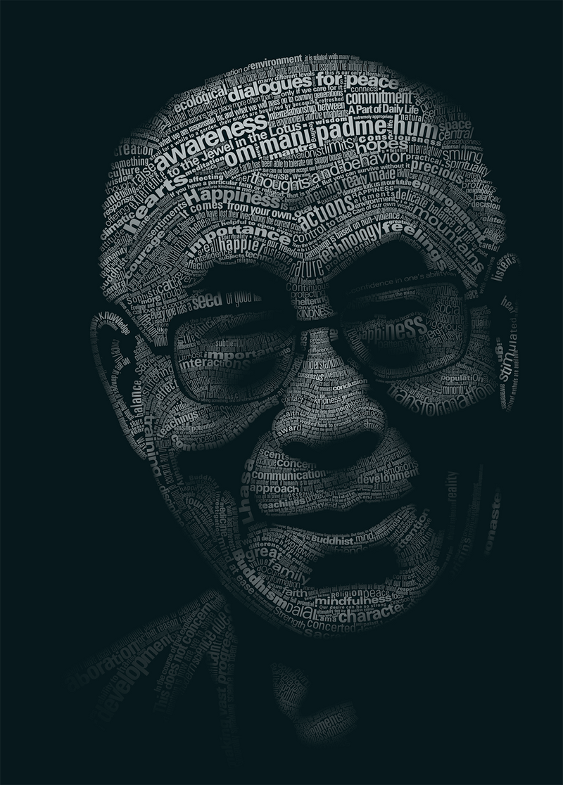
The image above uses type to create an image of the Dali Lama. Using a variation of the point sizes in the image, and the opacity of the type to create the light and shadows, adding depth to it.
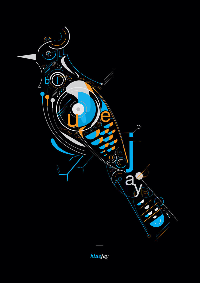
This image above uses type to as part of the image, complementing the vectors in the image. It also spells out the name of the piece, and what the image depicts; a blue jay.
Above, we see the letters NYC. Acting as a frame for a image, containing images which representing the culture and monuments in New York
The final image, which I believe is creative use of type would be this image, spelling the word octopus from octopus tentacles. I really like this, It's fun and creative.
Simplicity of Design
The design above has a very clean, simple layout to it. I like this image as it had been made through using very clean vector images, nice crisp colours.
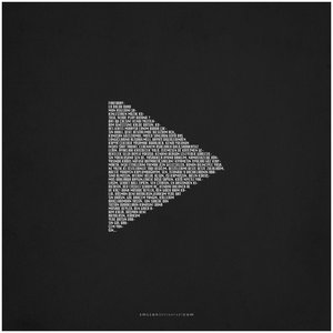
The image above is a play button, in the centre of a page, made from text. I like this image, not only because of the creative use of type, but because of the contrast between the white and the black, very modern and simplistic.
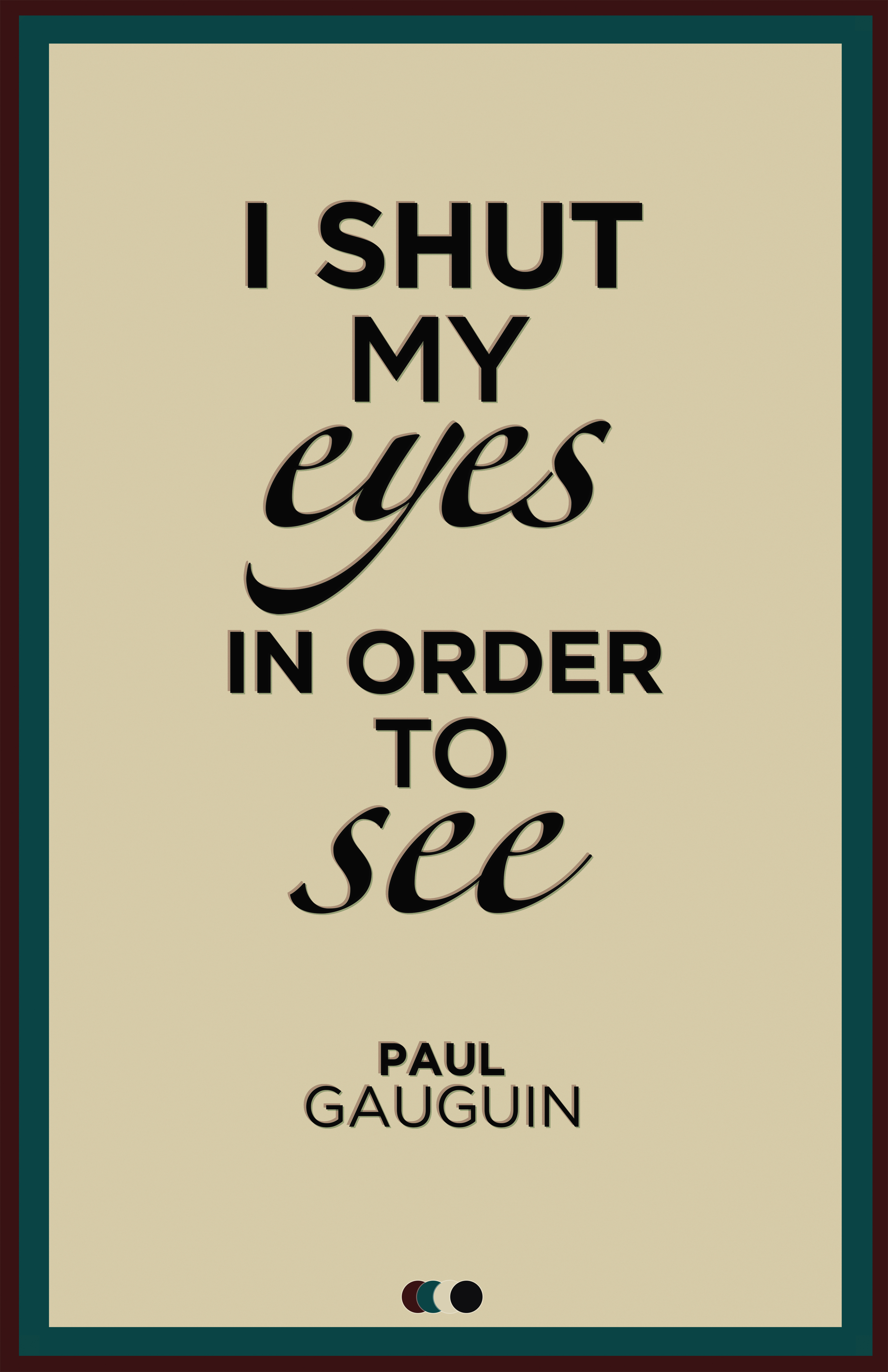
The image above is a "quote image", I like it because of the mild-tertiary colours used, giving the image an almost bland, sophisticated look, rather than bold bright, perhaps juvenile colours.
The image above is a simple text piece, using dark colours in the background, such as the greys, and then using a light baby-blue text, contrasting with the simplistic background, to make the text stand out.
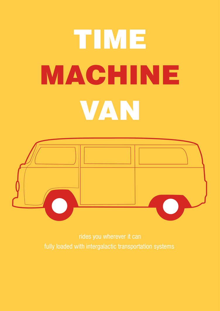
The image above is very simplistic, using only three colours, red, yellow and white. I really like how the image has a warm feeling from these colours, and the simplistic centre-aligned text and image has a nice quality to it.
Visual Quality
The image above has very good visual quality, the mark-making from the, perhaps, custom brushes with the greyscale images, overlaying the standard text, over a paper-texture background looks simply phenomenal In my opinion.
This image, In my opinion has fantastic visual quality. I love the simplicity and the design of the image. It has a nice overall feel to it.
The image above, using twigs to form the work crow, with crows flying above the word, looks fantastic. I really like the overall design of the image, and I think it has brilliant visual quality.
The image above, I believe has nice visual quality, with the low, dark texture background, with the vibrant text contrasting and really communicating the main text, Rockmantic, extremely well.
The final image from this set, was a new years piece. I really like this, using the 2012 as a frame for clock work components and the 0 being represented by a clock. I really think this image works really well.
Structure & Layout
I think the structure and layout of the image above is superb. Having the watches arranged across the page with the appropriate text accompanying them. The larger, greyscale image of the watch in the background really adds to the page too.
The image above is a very impressive layout, using a two column set up for the main body text, keeping all the text and images within the margins, on the left page of the spread, using a very clean professional layout.
I really like this image, using a the out of focus background over both the pages of the spread, with the two column type set up, aligned to the right. The type is also nicely presented, using a white clean typeface, working well over the blurry image.
The image above is a nice example of good layout and structure, using appropriate colours, columns, and creating an overall nice image, very eye catching and good to look at.
The final layout from the set demonstrates the 3 column layout, and deals with the large amount of type extremely well.
Tone of Voice
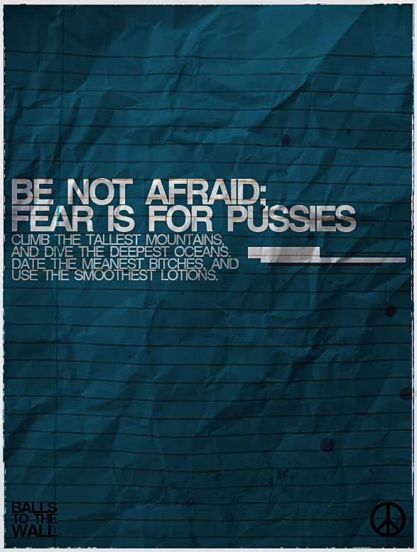
The above is an example of a blunt mature type of voice.
The above uses a mature, clam tone of voice, presumably addressing a large audience.
Another example of a mature tone of voice.
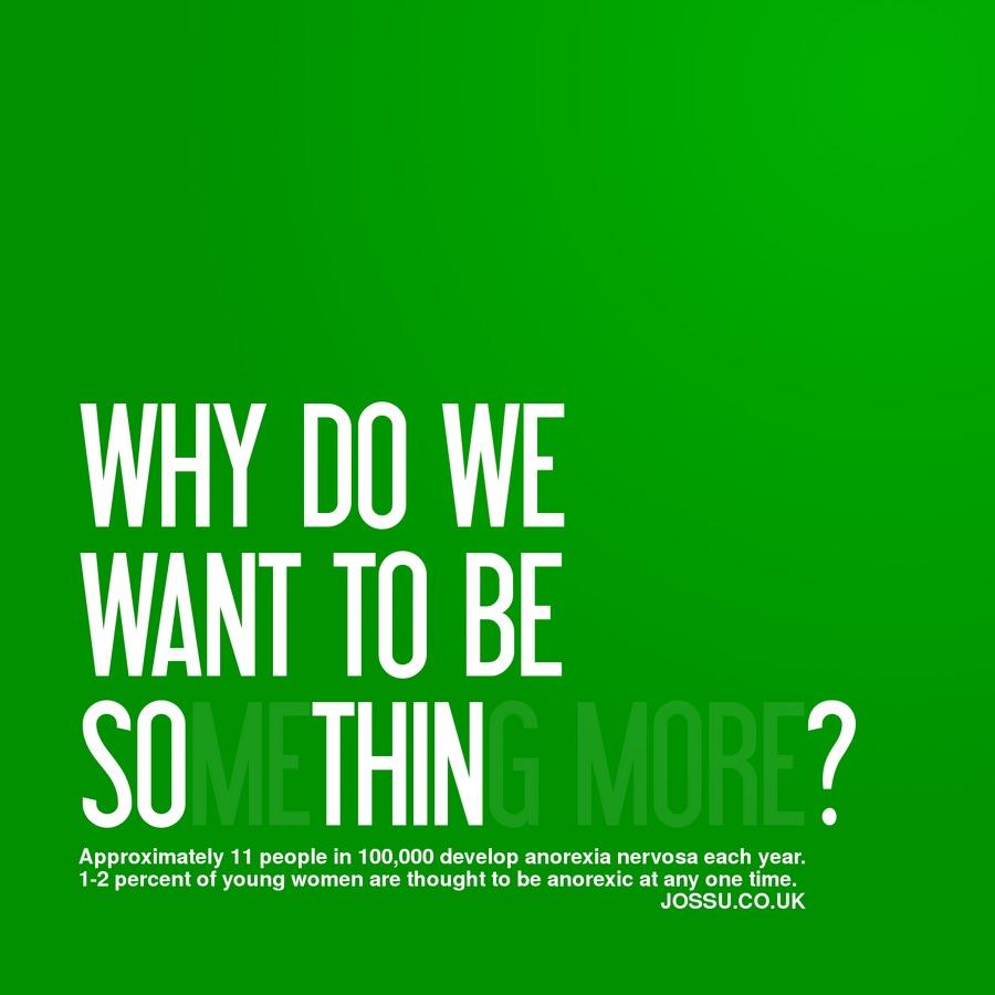
The text itself in this image has a particularly mature tone of voice, however, the way in which the type is presented indicates an almost immature light hearted sense to the image.
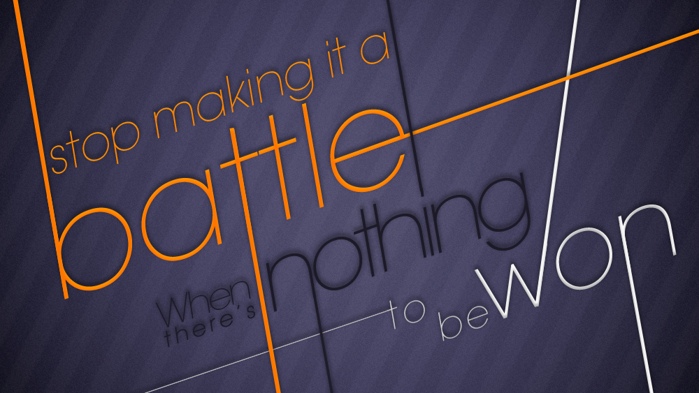
The final image of this set is a fairly light-hearted sensible, standard tone of voice, however the visual communicate in the image, the stylisation of the text adds a fun quality to the tone of voice, adding a layer of meaning to the image.








Leave your comment