Context

The recognisable 007 brand logo of the James Bond Franchise, I really like the simplistic design of this brand logo, which has stood the test of time since the 1962, when the first film of the 23, soon 24 super series was shown.

The above would be intended for publication, as the context. I really do like the design of this, and it's monocrome theme with the cream colour poping the image.
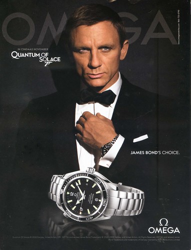
The above's context is advertisement. It features a nice simple design, easy to read, and clear. It also uses the James Bond brand along side this as endorsement, It's also using a very limited colour range in the ad, which works very well.

The above is an info-graphic, the context being directional way-finding. I really like the simplicity of the designs, nice, clean and to the point, easy to see, and the images on the signs make them understandable, even without the text.

The context of this would be promotional, it's a mini decorated in the Park Inn colours, Park Inn are recognisable by their bright colours in the checkered pattern, so covering a car is a really fun and creative way to be promotional.
Functions

The above is an info-graphic, the function of which is informing people about the Titanic tragedy, in an interesting and creatively beautiful way. I really like the design of it, and the colour scheme, using simplistic vector designs. It's really cool.
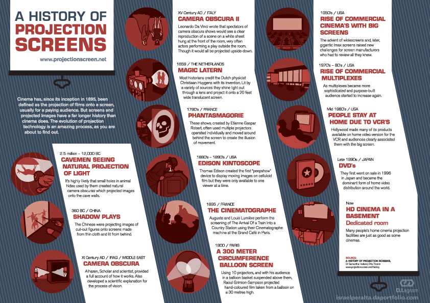
The above, the function being an info-graphic, informs us about the history of projection screens, dating back to the cave-men era to modern day home cinema in the basement. I really like the red limited colour scheme in the images, which correlates with the heading copy in the white text boxes to the side.

The above, the function of which, being again an info-graphic, Illustrates the advancement of human weaponry throughout time, in a simple and creative way. Once again, I really like the style of this, the vector shapes creating the tanks ans skyscrapers, and the people look fantastic, in the limited colour set, or yellows and greys.

The above, the function, once again, being an info-graphic set to inform people survey results, about "which Star Wars fi'm is the most favourited", it communicates this well.
Finally, for this section, we have another image, which it's function is to inform; it's in info-graphic. It takes a some-what boring subject and communicates it in a interesting and attractive way, I really like it. The break down of the images makes the process much easier to understand.
Messages/Ideas/Concepts

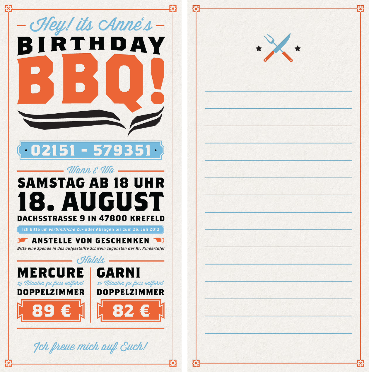
I really like this image above, it's an message, it's an invitation to a BBQ, as you can clearly see. It's well layed out, using oranges, blues and black as it's main, limited colour set, and works really well!
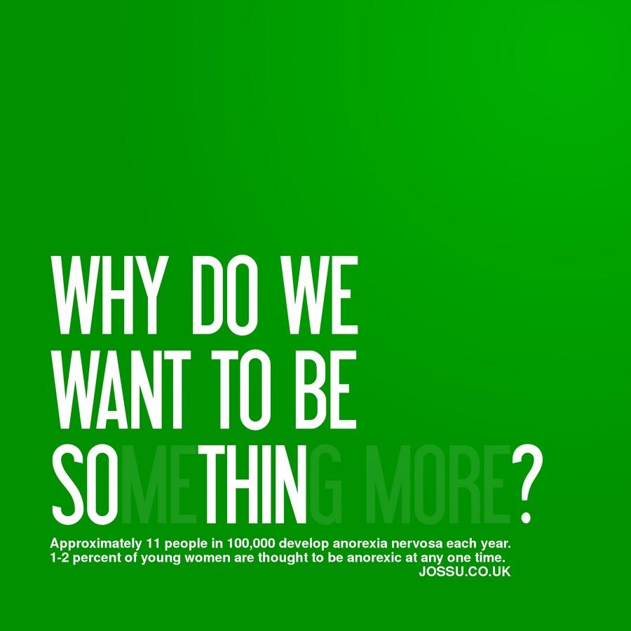
The above is a message once again, a message. It has a really nice and simplistic design to it, using a nice gradient of colour.
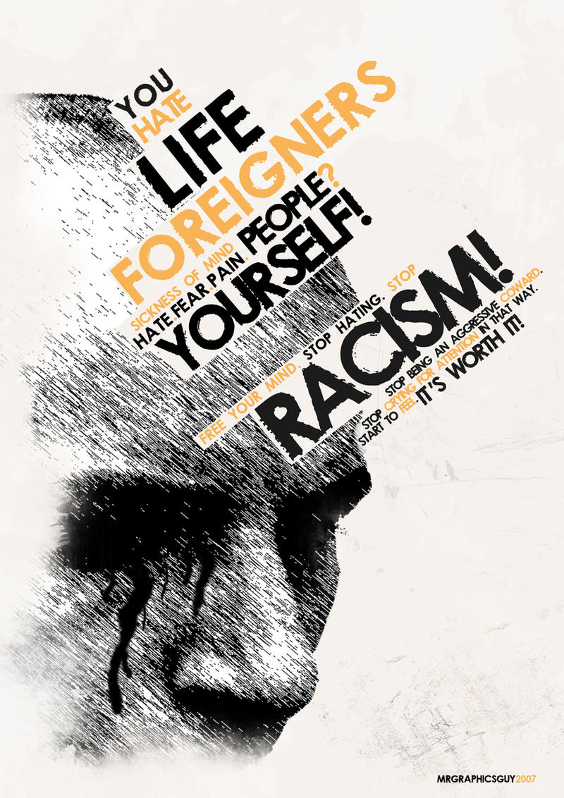
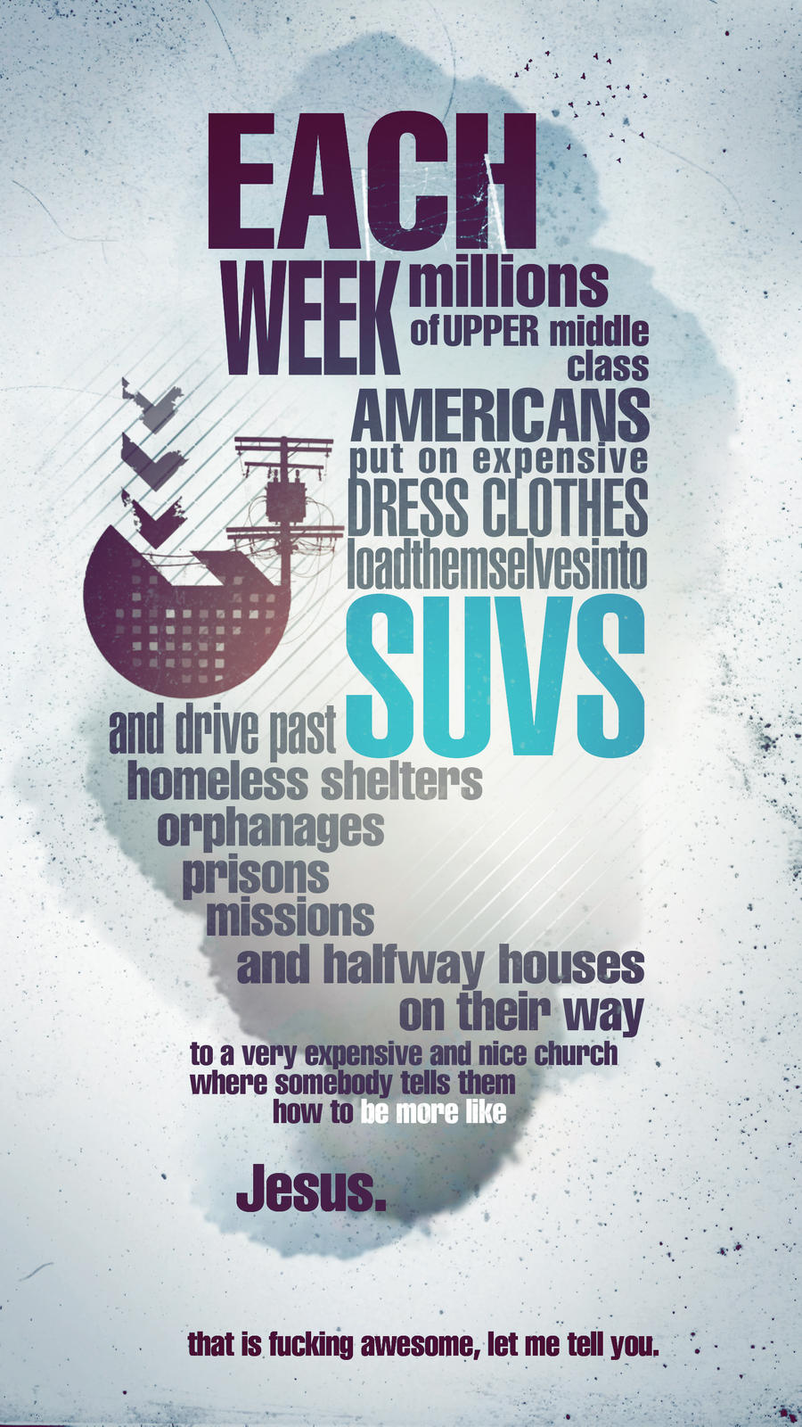
The above is an expressive statement, It's communicating anti-racism, and the hatred towards racism. It works really well, the monotone colours with the orange making the key words pop in the image, in a contrast to the blacks and whites.

Tone of Voice
The above is an example of a blunt mature type of voice.
The above uses a mature, clam tone of voice, presumably addressing a large audience.
Another example of a mature tone of voice.

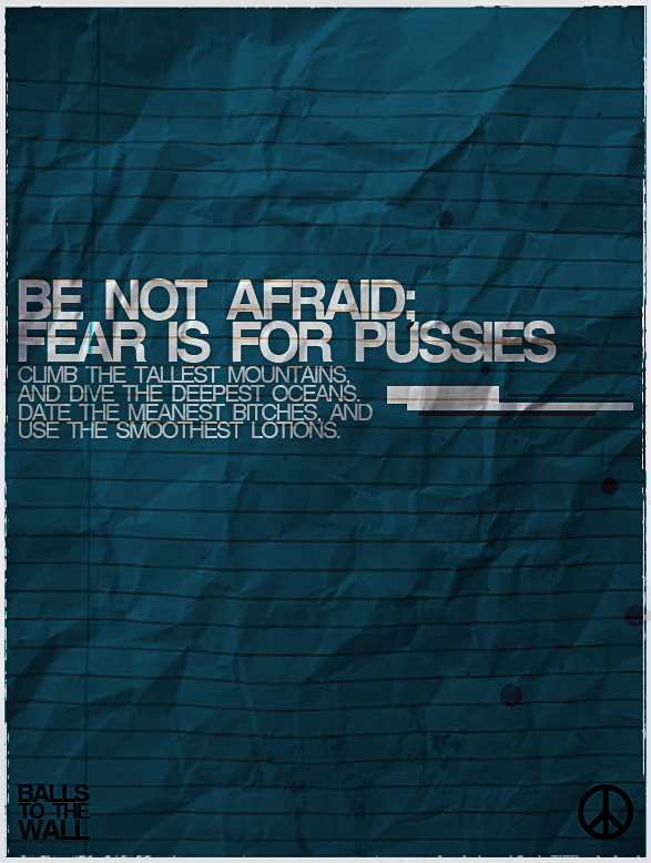
The text itself in this image has a particularly mature tone of voice, however, the way in which the type is presented indicates an almost immature light hearted sense to the image.

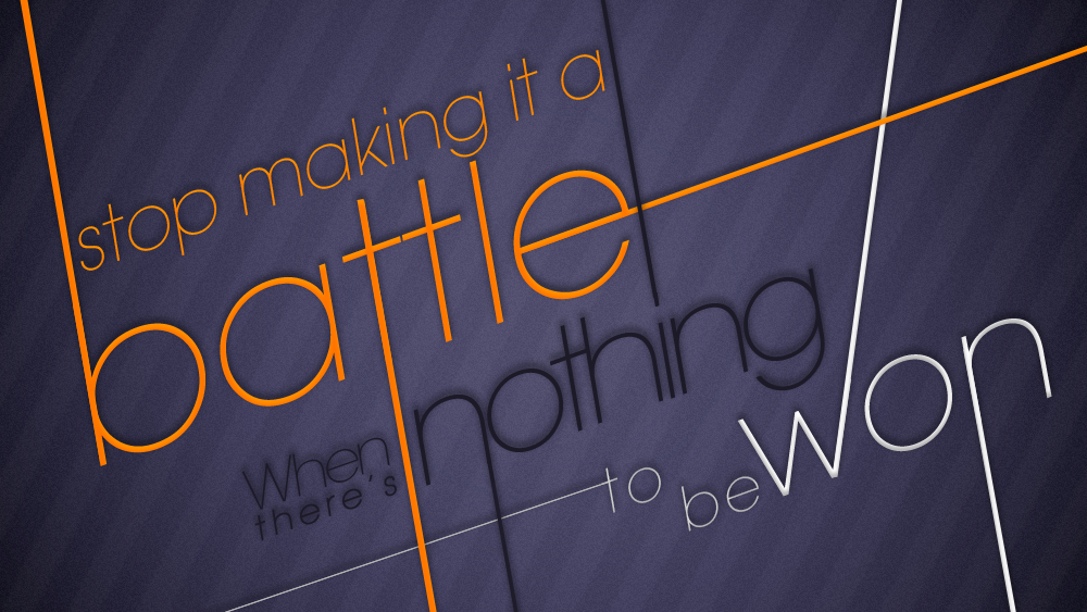
The final image of this set is a fairly light-hearted sensible, standard tone of voice, however the visual communicate in the image, the stylisation of the text adds a fun quality to the tone of voice, adding a layer of meaning to the image.
Intended Scale
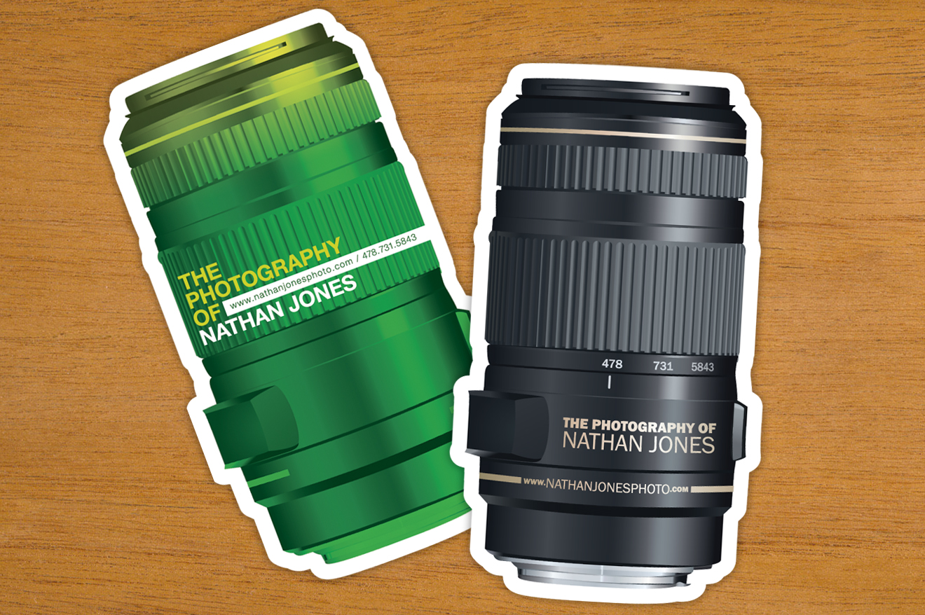
The above would be printed business card size, which is roughly around 80x45mm. I really like the design of these, It's creative and cool.
The above would be printed flyer size, A6.

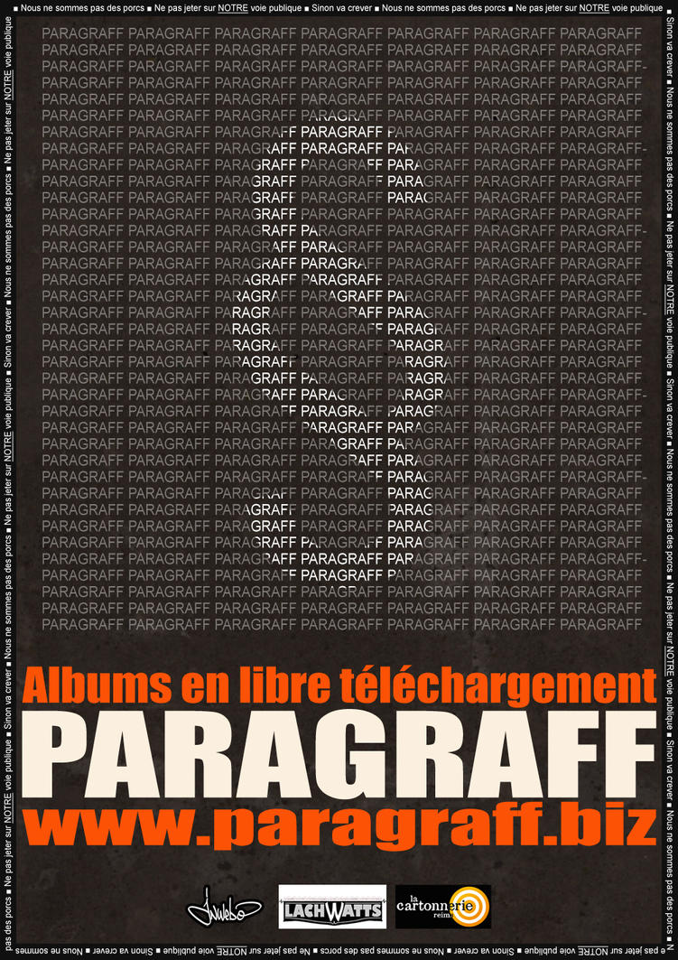
The above would be printed poster size, between A3 and upwards, typically A1.

The above would be a magazine spread, typically two A4 sheets, on one a A3 spread.

The above would be a billboard size image, a very large image.

Leave your comment