Ant White
Personal and Professional Practice
Archives
OUGD502: STUDIO BRIEF 2 - Design Presence // Final Branding Boards
For the submission of this module, I've created the final design boards which demonstrate the branding as a whole, how it works together and what it consists of, when laid out as a whole. The images in the boards show the range of the collateral produced for the project, and demonstrate how it all works together as a whole.


OUGD502: STUDIO BRIEF 2 - Design Presence // Logo Development
I've designed a logo for my brand, I started by mapping out who I am, as a brand. Based on my research into who I am, and how I should present myself.

Breaking it down into various sections, such as hobbies, interests, design formats, design styles, personality and myself as a professional. Doing this will allow me to decide what would be appropriate to brand myself as, and the themes which it would undertake. I spoke to my flat mates, Grace and Adam, who are also on this course, to verify I'm not over selling myself.

I also thought of what I should call myself. I broke it down into various elements of who I am, and what I'm called. I quite liked the idea of using my rugby positions as the numbers, an alias, rather than something plain, like 'Anthony'.

I began with sketching out my logo using a very precise and plain grid system... which as you'll see later, ended up being scrapped due it's plain boring nature.


I constructed the logo in illustrator, and it doesn't look terrible, but it could be improved.
Approaching the logo from another angle

I went to town, using the fibonacci spiral, as I had just developed my understanding of this system in another module, Which I think gave a better result for the logo than my previous attempts.

I then used a deep blue and red for my colour scheme, these colours have been sampled from the Munster Rugby colours. I've used colours of my favourite team, as the brand is rugby orientated, so I thought I would be appropriate. I altered the colour slightly, to make their contrasts more aesthetically pleasing.

I tried a colour invert, and some tweaks incorporating the alpha channels. It looks alright, however it don't think it works. The contrasting colours suggest a divide in the logo, This also means when the logo is applied onto one of the colours, the logo only will look like half a logo, as the colours will blend. To fix this, I would have to add a third colour to the palette. It also looks like the mass effect N7 logo.
Applying the Logo to Business Cards
For a test, I applied the logo to the business cards. I created an 85 x 55mm document with a 3mm bleed around each edge.

I used the type within the logo to dictate the spacing around the edge of the logo, to the edge of the card.

Final logo on the business card.
Another Branding Idea I tried (failed)
In an hour of doubt, I also tried to create a logo based on the Star Wars theme, as I'm a huge fan of the films, and the culture behind it. I'm particularly interested in the stories which are set before the films, thousands of years before, what's known as The Old Republic. Choosing an aspect of this would almost be like an inside joke.

I decided to try a starship as the basis for the logo, I used a ship known as the Ebon Hawk, which appears in numerous novels in the Star Wars universe.

I used the fibonacci system to create the proportions for the logo. It was an ambitious idea, just to make the logo look slightly more aesthetically pleasing, whilst maintaining it's current shape.


The what would've been final illustration for the logo. It looks okay, however the idea seems to out there for feasible branding.
Final Logo

OUGD502: STUDIO BRIEF 2 - Design Presence // What is a Brand?
As part of my research for this task, I want to establish what a brand is, to do this, I've followed one of the resources from estudio, which lead me to http://justcreative.com/2010/04/06/branding-identity-logo-design-explained/ Which goes onto explain what a brand is, whilst also offering links to publications which take the topic further and further.
Many people believe a brand only consists of a few elements – some colours, some fonts, a logo, a slogan and maybe some music added in too. In reality, it is much more complicated than that. You might say that a brand is a ‘corporate image’.
The fundamental idea and core concept behind having a ‘corporate image’ is that everything a company does, everything it owns and everything it produces should reflect the values and aims of the business as a whole.
It is the consistency of this core idea that makes up the company, driving it, showing what it stands for, what it believes in and why they exist. It is not purely some colours, some typefaces, a logo and a slogan.
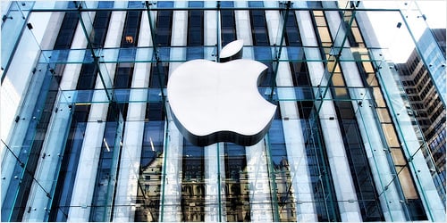
As an example, let’s look at the well known IT company, Apple. Apple as a company, projects a humanistic corporate culture and a strong corporate ethic, one which is characterised by volunteerism, support of good causes & involvement in the community. These values of the business are evident throughout everything they do, from their innovative products and advertising, right through to their customer service. Apple is an emotionally humanist brand that really connects with people – when people buy or use their products or services; they feel part of the brand, like a tribe even. It is this emotional connection that creates their brand – not purely their products and a bite sized logo.

One major role in the ‘brand’ or ‘corporate image’ of a company is its identity.
In most cases, identity design is based around the visual devices used within a company, usually assembled within a set of guidelines. These guidelines that make up an identity usually administer how the identity is applied throughout a variety of mediums, using approved colour palettes, fonts, layouts, measurements and so forth. These guidelines ensure that the identity of the company is kept coherent, which in turn, allows the brand as a whole, to be recognisable.
The identity or ‘image’ of a company is made up of many visual devices:
- A Logo (The symbol of the entire identity & brand)
- Stationery (Letterhead + business card + envelopes, etc.)
- Marketing Collateral (Flyers, brochures, books, websites, etc.)
- Products & Packaging (Products sold and the packaging in which they come in)
- Apparel Design (Tangible clothing items that are worn by employees)
- Signage (Interior & exterior design)
- Messages & Actions (Messages conveyed via indirect or direct modes of communication)
- Other Communication (Audio, smell, touch, etc.)
- Anything visual that represents the business.
What is a logo?

To understand what a logo is, we must first understand what it is for.
A logo is for… identification.
A logo identifies a company or product via the use of a mark, flag, symbol or signature. A logo does not sell the company directly nor rarely does it describe a business. Logo’s derive their meaning from the quality of the thing it symbolises, not the other way around – logos are there to identity, not to explain. In a nutshell, what a logo means is more important than what it lookslike.
To illustrate this concept, think of logos like people. We prefer to be called by our names – James, Dorothy, John – rather than by the confusing and forgettable description of ourselves such as “the guy who always wears pink and has blonde hair”. In this same way, a logo should not literally describe what the business does but rather, identify the business in a way that is recognisable and memorable.
It is also important to note that only after a logo becomes familiar, does it function the way it is intended to do much alike how we much must learn people’s names to identify them.
The logo identifies a business or product in its simplest form.
Summary:
Brand –The perceived emotional corporate image as a whole.
Identity – The visual aspects that form part of the overall brand.
Logo – Identifies a business in its simplest form via the use of a mark or icon.
Brand –The perceived emotional corporate image as a whole.
Identity – The visual aspects that form part of the overall brand.
Logo – Identifies a business in its simplest form via the use of a mark or icon.
Subscribe to:
Posts (Atom)

Copyright 2010. All rights reserved.
RSS Feed. This blog is proudly powered by Blogger and uses Modern Clix, a theme by Rodrigo Galindez. Modern Clix blogger template by Introblogger.